.png)
Published
Marketing campaigns are temporary. A product, once in a consumer's hands, makes its argument every time it is used. The stitching, the weight, the way a zip pulls, the choice of fabric - each of these is a decision that either supports or contradicts whatever a brand claims in its advertising.
This tension between what brands say and what they make is rarely discussed directly, but it shapes consumer trust more than most brand managers would care to admit. When a product delivers on its implied promise, the relationship between buyer and brand deepens without a single word being spoken. When it does not, no amount of campaign spend closes that gap.
Understanding how design communicates - and why it often speaks more clearly than marketing - is useful both for consumers trying to make better purchasing decisions and for anyone trying to assess whether a brand's reputation is genuinely earned.
The Signal Before the Sale
Before a product is purchased, design begins transmitting information. Packaging, colourways, material weight, silhouette - these cues trigger associations that are largely pre-rational. A consumer does not consciously audit a garment's construction in a retail environment, but they register it.
This is not trivial. Research into consumer behaviour consistently finds that tactile and visual impressions at the point of contact influence perceived quality in ways that subsequent experience either confirms or revises. The first impression set by design is therefore a kind of contract - one the product must honour across its usable life.
Brands that understand this invest in design not merely as aesthetics but as communication strategy. Those that treat design as a secondary concern to marketing spend tend to produce products that feel inconsistent - premium in presentation, disappointing in use.
Functional Honesty
One of the clearest ways design communicates brand values is through functional honesty - the degree to which a product's design reflects its actual purpose rather than an aspirational one.
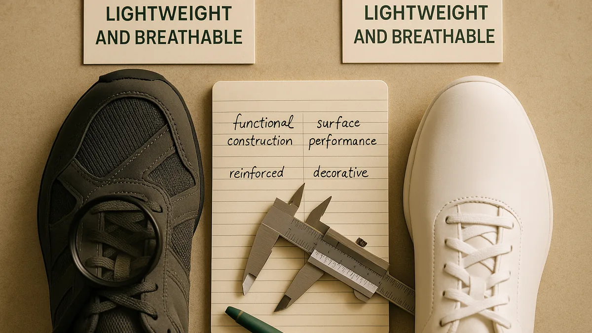
A running shoe engineered for training distances communicates differently from one designed to look like a running shoe. The former has visible evidence of its intentions: appropriate cushioning profiles, reinforced zones at predictable stress points, breathable panelling placed where heat accumulates during sustained effort. The latter typically sacrifices these details for visual appeal, and the omissions are detectable under use.
Mizuno has historically built its reputation on this kind of functional integrity. Its Wave plate technology, for instance, is not simply a visual motif - it is a structural element that distributes impact forces across a defined geometry. Consumers who use Mizuno footwear for the purposes it is designed for tend to find that the design rationale holds under pressure. That consistency is itself a form of communication that no marketing campaign could replicate - because it only becomes legible through experience.
Heritage as Design Language
Brands with genuine heritage face a particular design challenge: how to carry historical identity forward without becoming a costume of their own past.
Fila presents an instructive case. Its archive of 1970s and 1980s tennis and sportswear carries strong design equity - the colour blocking, the BJ logo, the heavy cotton-polyester construction that defined an era of premium European sportswear. When Fila reissues heritage silhouettes, the design communication is layered: it speaks simultaneously to consumers who remember the original context and those encountering it without that reference point.
The risk with heritage-led design is that it can become purely referential - nostalgic rather than functional, backward-looking rather than resolved. When the archive is reissued faithfully, the design credibility holds. When it is approximated cheaply, consumers familiar with the originals notice immediately, and the gap between marketing claim and product reality becomes apparent.
The Role of Consistency Across a Range
A single well-designed product can be an outlier. Consistent design language across an entire range is much harder to achieve and much more revealing of a brand's actual values.
Reebok's trajectory over the past two decades illustrates how range consistency - or the loss of it - changes what a brand communicates. At its most coherent, Reebok's product range carried a legible identity across training, running, and lifestyle categories: clean construction, restrained detailing, a preference for function-forward silhouettes. Periods of ownership transition and market repositioning introduced inconsistencies that consumers could read in the products themselves - different quality standards across categories, design vocabularies that did not obviously belong to the same brand.
The current iteration of Reebok, operating under its own ownership since 2022, has been working to re-establish range coherence. Whether it succeeds is a question the products will answer more definitively than any brand statement.
When Design Tells a Different Story from the Campaign
The most revealing moments in brand analysis occur when product design and marketing are clearly misaligned. This misalignment tends to take one of two forms.
The first is aspirational overreach: a brand markets a product as performance-grade but produces it to a specification that cannot support that claim. Materials chosen for cost rather than function, construction shortcuts that only become apparent with use, fit and finish that reads as approximate rather than considered. This form of misalignment is common in mid-market sportswear and tends to erode trust gradually as consumers accumulate experience.
The second form is more subtle: a brand with genuine product quality fails to communicate it through design. This is the inverse problem - where marketing undersells or misrepresents what is actually a well-made product, leading consumers to undervalue it or overlook it in favour of louder competitors.
Champion occupies an interesting position relative to this second dynamic. Its core fleece products - the Reverse Weave line in particular - are constructed to a standard that has remained largely unchanged for decades: a heavyweight loopback cotton construction with a horizontal weft designed to resist vertical shrinkage. The design rationale is visible in the product. Yet Champion has historically underinvested in communicating this quality through marketing, leading to a persistent gap between what the product delivers and how the brand is perceived in relation to more aggressively marketed competitors.
Materials as Meaning
Material selection is one of the most direct forms of design communication, and one of the easiest for consumers to assess without specialist knowledge.
Weight, hand-feel, recovery after stretch, pill resistance, the sound fabric makes under movement - these characteristics are immediately perceptible and carry strong quality signals. A fleece that pills after three washes, or a base layer that loses its shape after moderate use, is communicating something quite specific about the choices made during its development.
Conversely, materials that perform consistently over extended use create a different and more durable relationship with the consumer. This is particularly relevant in performance categories - training apparel, technical outerwear, sport-specific footwear - where material behaviour under stress is the primary measure of product integrity.
The challenge for brands is that material quality is invisible at point of sale and only becomes legible over time. This creates pressure to invest in materials that look impressive in a retail environment regardless of how they perform in sustained use - a short-term strategy that tends to produce poor long-term brand equity.
Construction Detail and What It Signals
Beyond materials, construction detail communicates intentionality. Flatlock seams versus standard overlock, reinforced bar-tacking at stress points, the placement of internal labels relative to skin contact zones, the behaviour of zip pulls under repeated cycling - each of these is a decision, and the accumulation of those decisions is what distinguishes a product designed carefully from one assembled to a price.
Experienced consumers often develop sensitivity to these details without consciously cataloguing them. They simply know, through extended use across multiple purchases, what careful construction feels like - and they recognise its absence. This intuitive literacy means that product design cannot be faked over the long term, regardless of how sophisticated the marketing around it becomes.
Brands that consistently make considered construction choices tend to build consumer relationships that are more durable than those established through campaign activity alone. The product becomes the evidence. The marketing becomes, at best, a useful introduction to evidence that exists independently.
Conclusion
Product design does not merely complement a brand's marketing - in most cases, it precedes and outlasts it. Consumers encounter products in use long after they have forgotten the campaign that introduced them, and it is the experience of use that ultimately determines whether trust is built or spent.
Brands that treat design as a primary communication channel - encoding their values into material choices, construction decisions and functional rationale - tend to build more durable reputations than those that rely primarily on campaign activity to carry their message.
The inverse also holds. No amount of campaign sophistication compensates for design that fails to support its claims. The product is the argument, and over time it makes that argument more persuasively than any other channel available to a brand.
For consumers and reviewers alike, this means that close attention to what a product actually does - how it behaves, wears, and holds up - remains the most reliable basis for assessment. Design communicates; the task is to read it carefully.